We have begun to formalize our observations into statistics to supplement the project's functionality. We are expanding the space where numbers and facts are transformed into real tools of influence for everyone who does not want to finance war through their purchases. The statistics are built around interactive graphs that do not just illustrate, but literally “chew” for the user: who, where, when and in what area still supports the aggressor country.
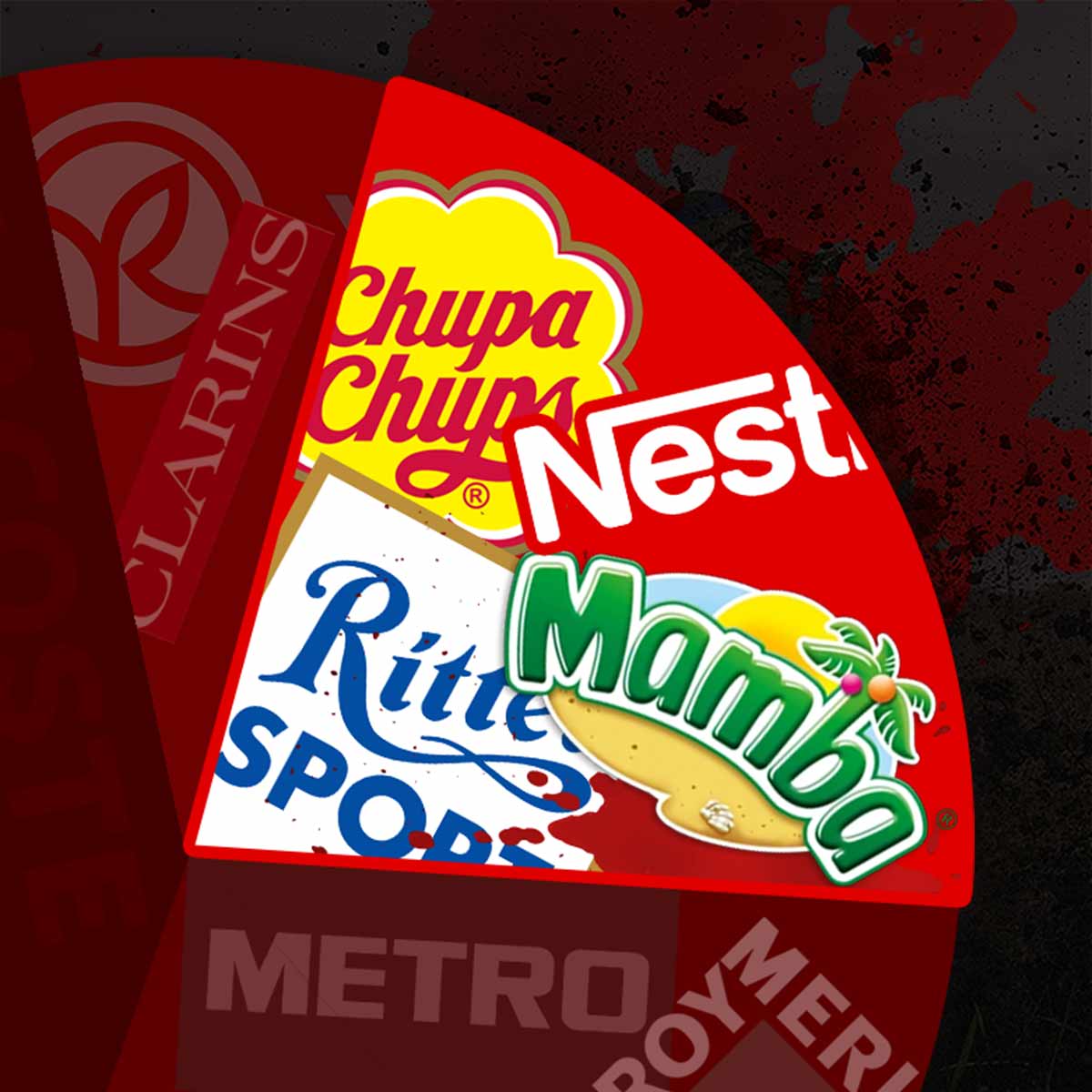
This project is not just numbers to tick off. Here you can find specific brand names, from giants to local producers. Understand how to properly form your personal boycott list.
What can these statistics on the occupier's sponsors tell you?
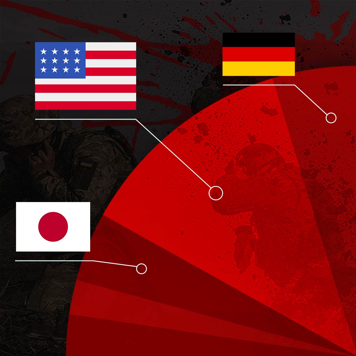
A wide list of companies from different countries — this is indicated by the large number of sectors in the pie chart.
Wide variety of categories — 26 categories of companies and 19 product categories, meaning that a boycott is being called for in many areas (from products to technologies).
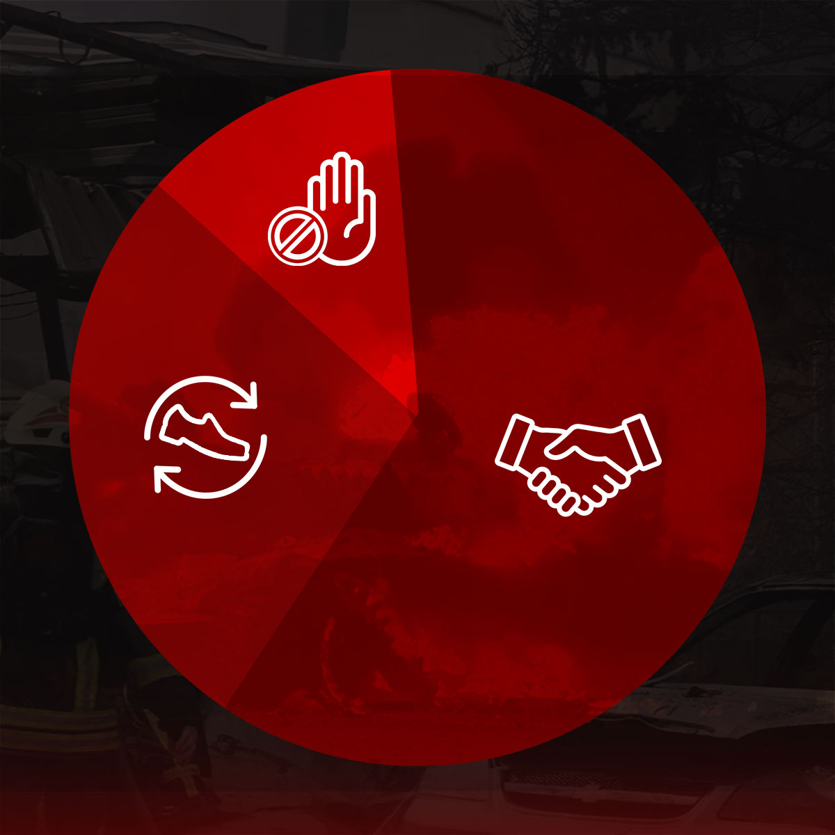
Displaying statuses — not all companies behave the same: some have left the market of the occupying country, some continue their activities, and some have suspended them.
Who are these war sponsor statistics for?
Conscious consumers: To know what products to buy without a guilty conscience.
Journalists and activists: For analytics, investigations, and creating information campaigns.
Organizations and businesses: To review supply chains and make ethical decisions.
*If you found the answer to your question, support our volunteer project by subscribing or donating:
One-time donation to the bank
Monthly subscription


